I have Stampin' Up! workshops at my house once a month, and one of my problems, is that I design a card and then I look and I don't have enough paper for everyone to do it EXACTLY the same 10 more times! Especially with the DSP, there are only 2 sheets of the 'same' paper is pack, and depending on how many samples or trys I make, I might end up being short! The gals that come like to make the card just like my sample, but sometimes....
I need to give out kits that are different papers, Stampin' Up! makes it easy as usually the pack of DSP coordinates well with each other, you can also turn over the paper to for a whole new design. That is what I usually do when I am at a class, I look at the sample then think, hmmmm, can I turn this over? Will it still work?
Different words, but the same punch, and the 'shadow' punch behind is the same punch cut in half then pieced together so that just a part of the punch shows.
I used colored staples to hold the flap back on the front, and the leaves were die cut, while the flower was stamped then punched out.
This card the fold back was larger, maybe the yellow strip of DSP was thinner? and I used eyelets to hold the flap back, this leaf has 2 sizes in 2 colors for dimension. I used the word window punch to punch out the words and the modern label punch to put behind the words.
The top 2 cards also used leaves punched from the Stampin' Up! bird punch so they have a stem and 'viney' look.
Don't be afraid to do a card different than the sample, the sample is just a guide, just an example, it is your card and ultimately all of the choices are up to you!
Thanks for stopping by!
Tuesday, August 11, 2015
Saturday, August 8, 2015
Same design, different colors
Same design, different colors! Certainly Celery and Blushing Bride, and So Safron and Ballet Blue I do believe!
I like them both! I do like stamping on a whole sheet of paper, 8.5 x 11 creating my own background paper, you can cut them up into whatever shapes you need. It is fun to experiment with colors and images to see what you like best. I like the way I lifted and folded back the bottom left corner of the 2 sided DSP to reveal the 'back-side'.
I used eyelets, they used to be all the rage, and now they have died out some what, but I have lots to use and do like to use them.
The words are from an old Stampin' Up! set, and the fancy corners are from DOTS. The flowers are from Stampin' Up! as I have LOTS of flower stamps! Flowers and butterflies! The BEST!
Thanks for stopping by!
Tuesday, August 4, 2015
Baby Boy card
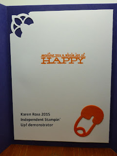
I made this card at Billie's house, her images and her words, I think the paper was mine, this is tri-fold or gate cad, the feet and words are attached only to the left side of the front.
We get so used to making 'regular' cards that we forget about these fancy folds and they are fun, and a cool way to use 2 kinds of DSP on the front.
The safety pin inside was a die cut that Billie had and I like the fancy corner punch on the inside.
Thanks for stopping by!
We get so used to making 'regular' cards that we forget about these fancy folds and they are fun, and a cool way to use 2 kinds of DSP on the front.
The safety pin inside was a die cut that Billie had and I like the fancy corner punch on the inside.
Thanks for stopping by!
Sunday, August 2, 2015
Anniversary
This would make a great wedding or anniversary card. Since my husband and I just celebrated our 34th anniversary I thought this was appropriate. The background paper was the special paper from Stampin' Up! at Sale a Bration time, it was white paper with a white image embossed on it, then you add color via a brayer or sponges or spritzer. Very cool paper, and they have a new set of designs in the catalog.
Many of the Stampin' Up! images, are large words are are great as they can be the focal point of the card and not need much else to complete the design.
Thanks for stopping by!
Subscribe to:
Comments (Atom)


